Hotel Booking - Desktop design
Competitive Benchmark
While researching hotel websites by established brands, I realized the mapping and locations functions varied greatly with each site. I personally tend to choose my hotels based off of their distance to my main destinations, so an intuitive map made the sites much more enjoyable to browse. Thankfully the usability tests I performed confirmed I didn’t have an isolated viewpoint. Overall, competitive benchmarking was fun for this project; I got to imagine elaborate vacations where budget wasn’t an issue.
Usability Test
I ran usability tests and interviews on two individuals for this project. My wife was the first subject, and she navigated the sites similarly to myself. She ran into the same issues that I had identified in the competitive benchmarking. The second test was on a grocery store employee, and those results were very interesting. His wants and concerns, and his style of navigation, were very divergent from the first test and my own usage of these sites. At the core though, the issues were the same; the site should remember me better, and the mapping locator is difficult to understand.
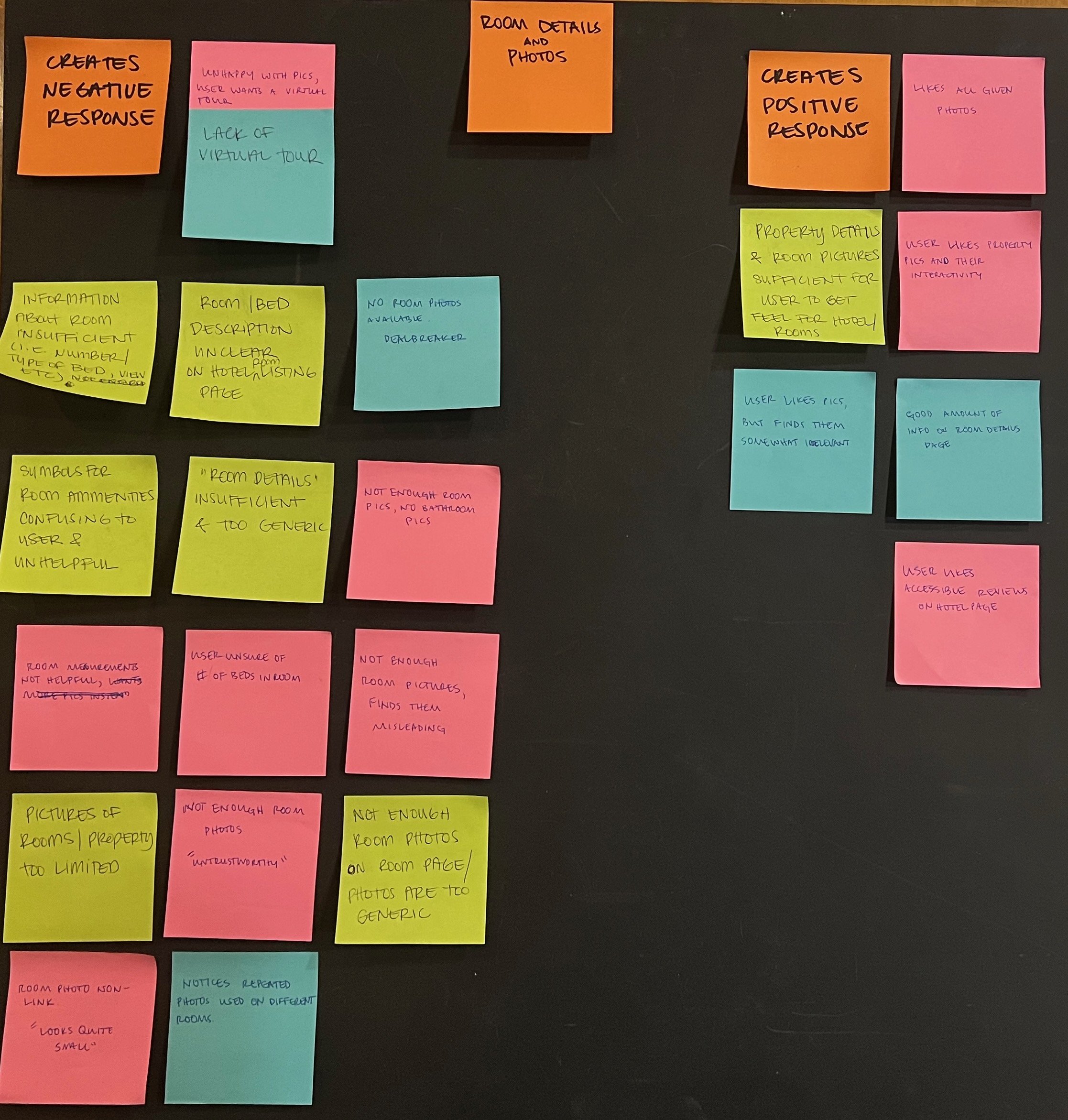
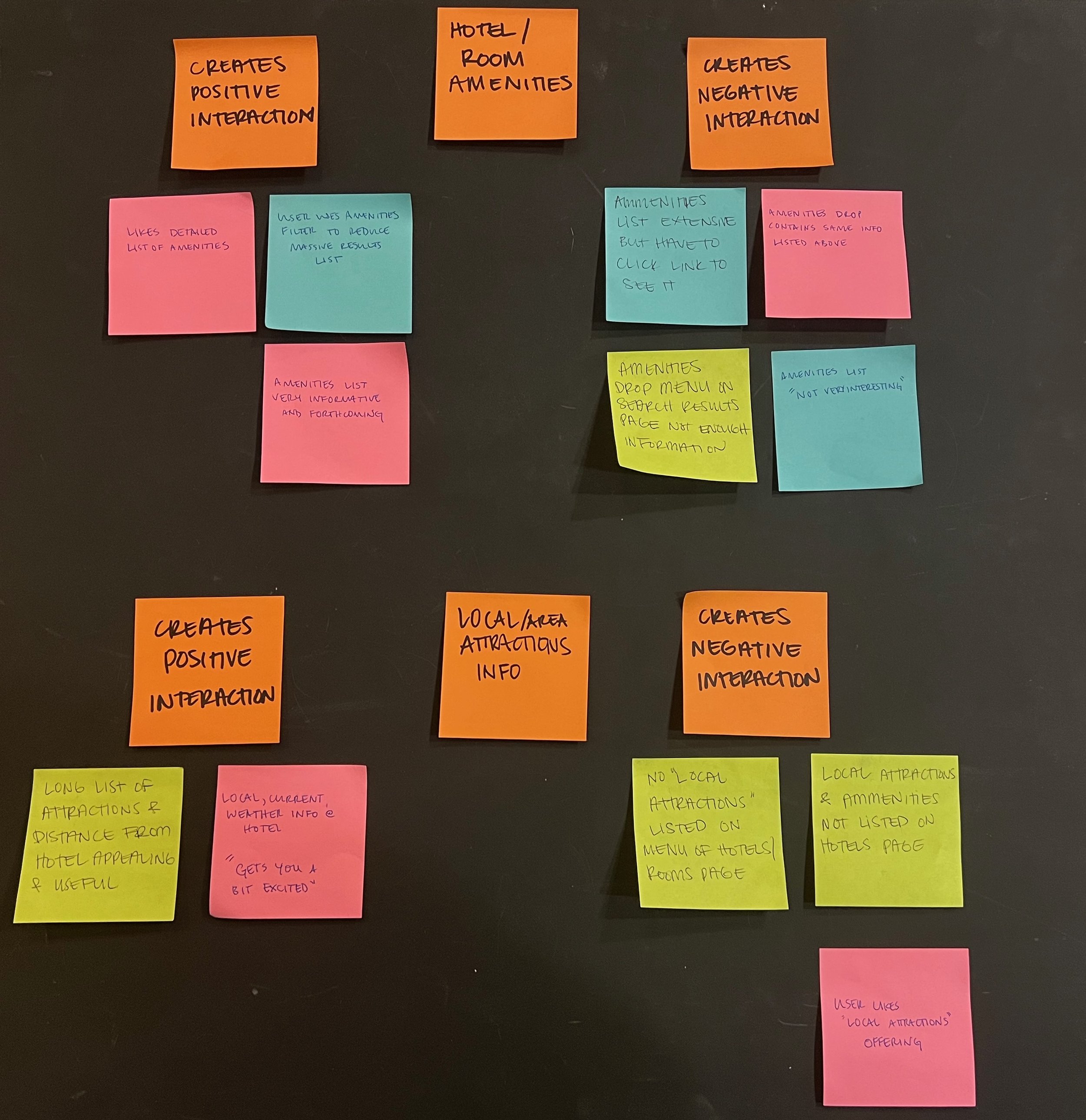
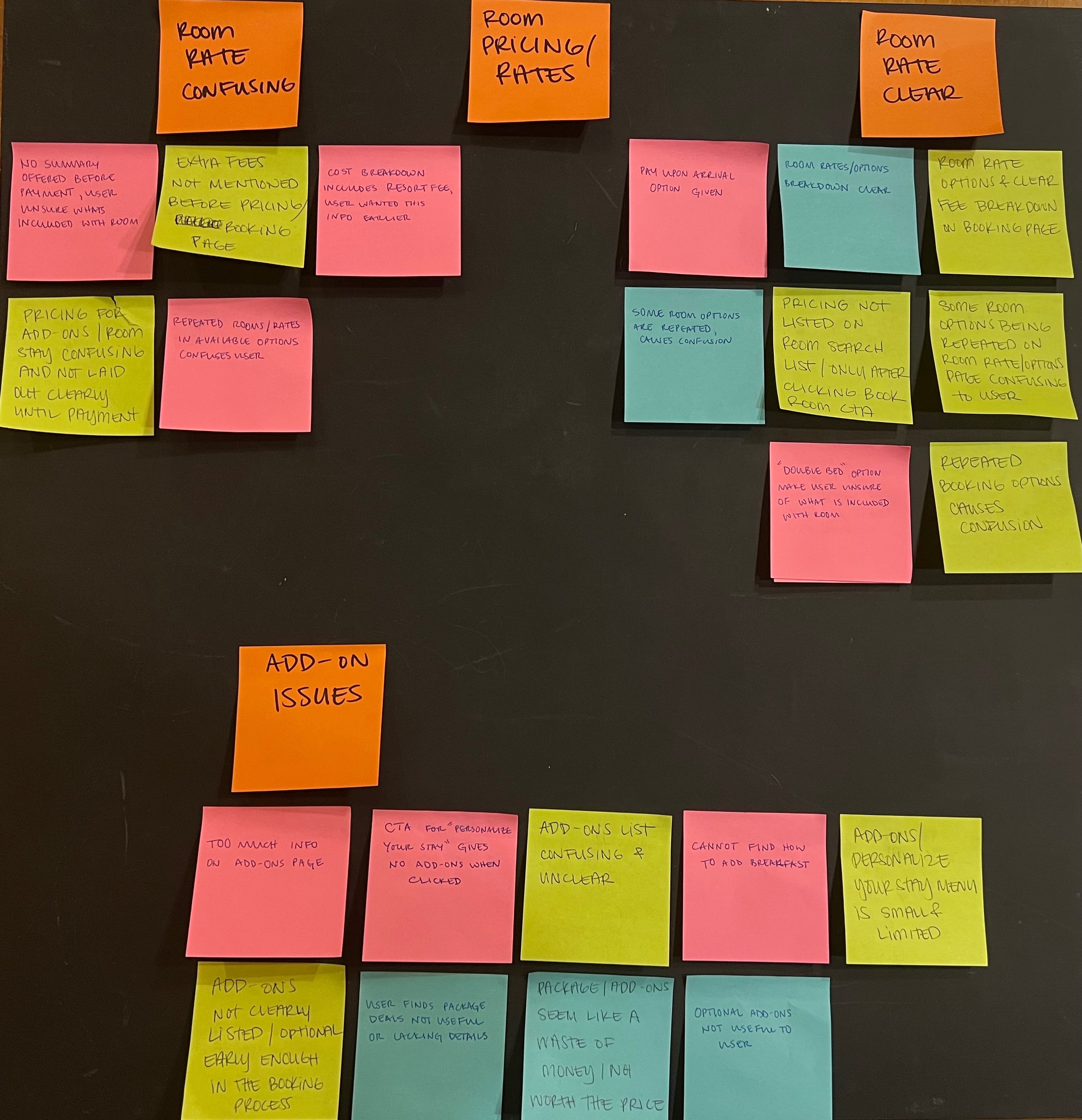
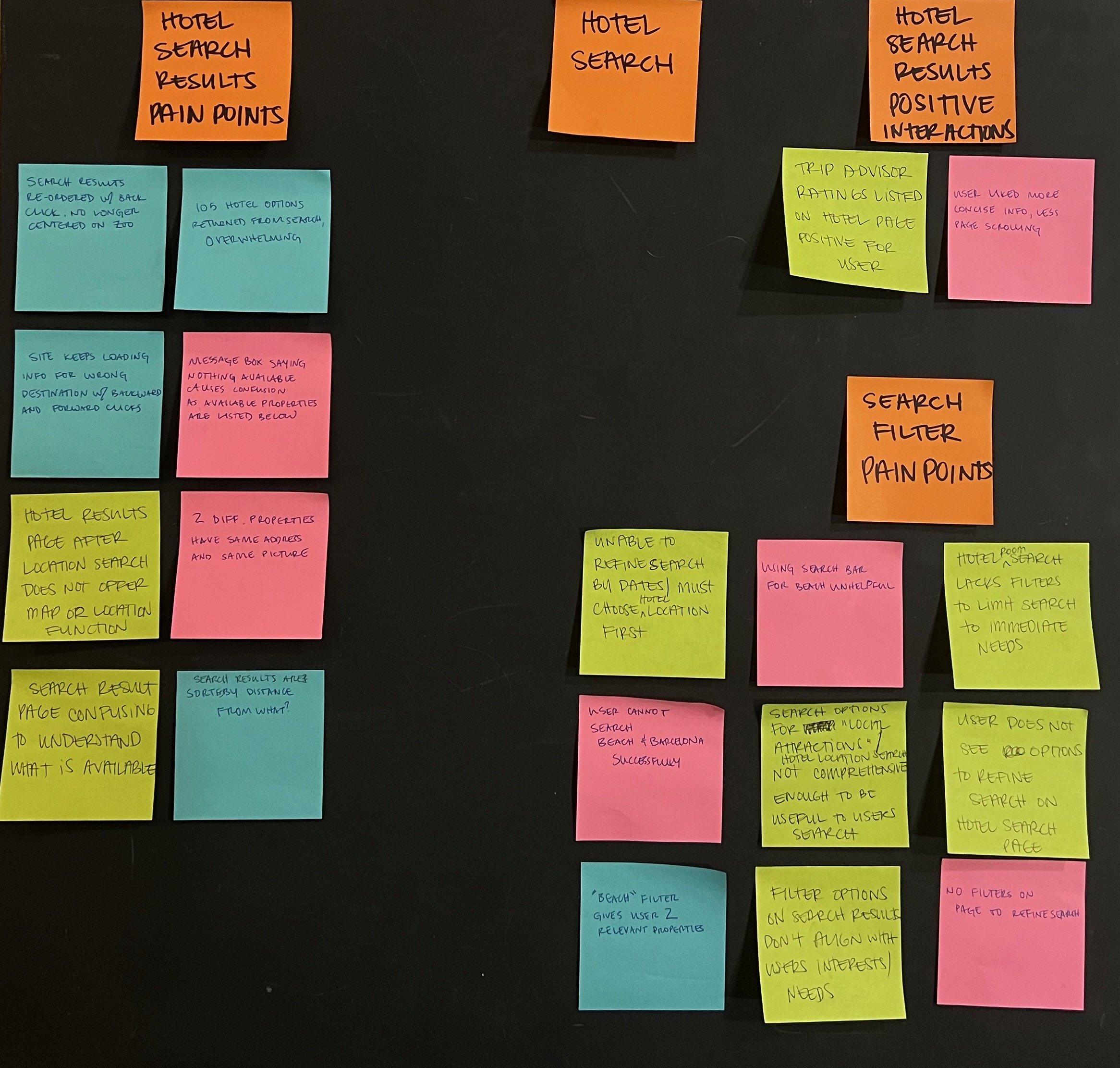
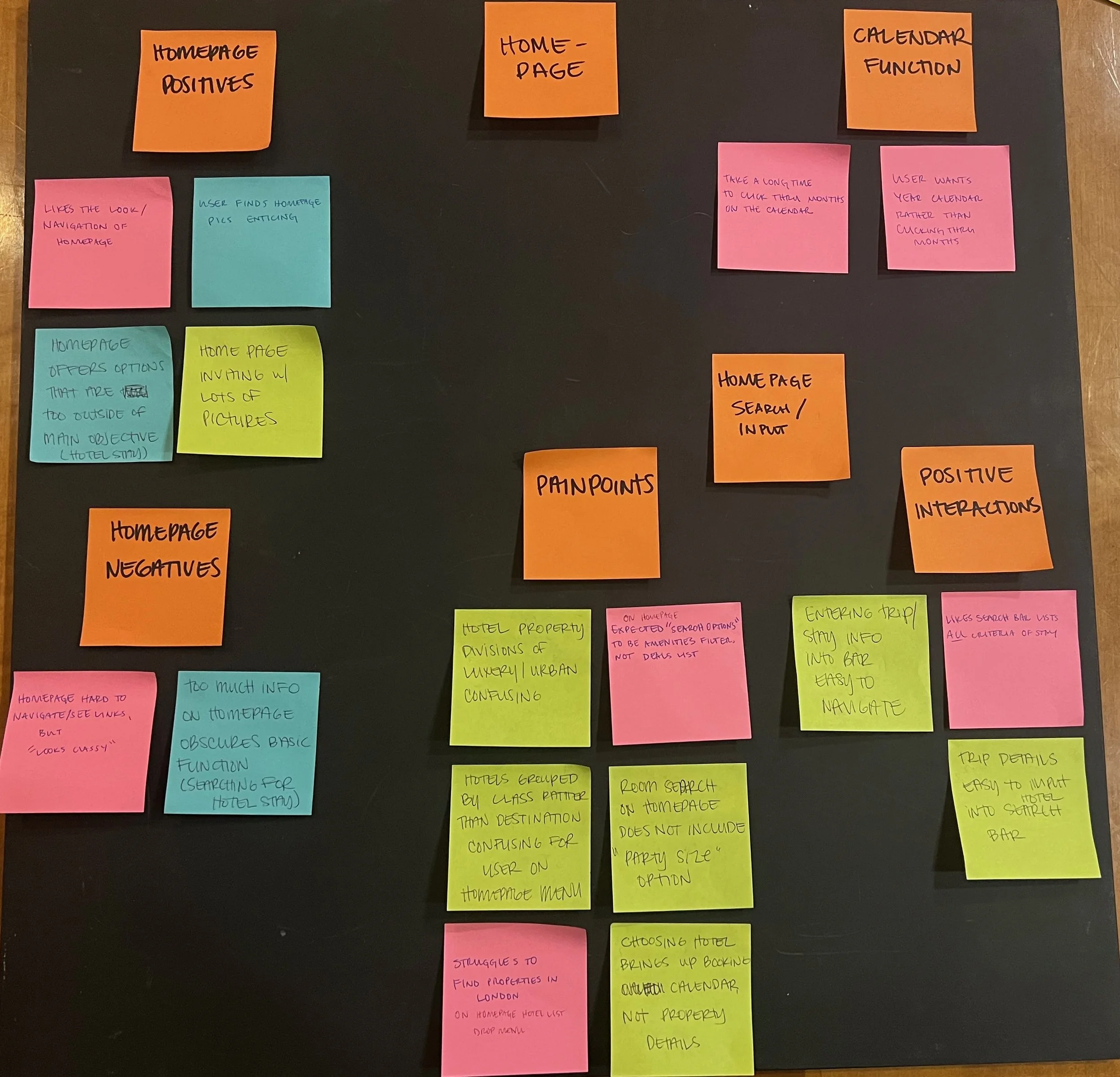
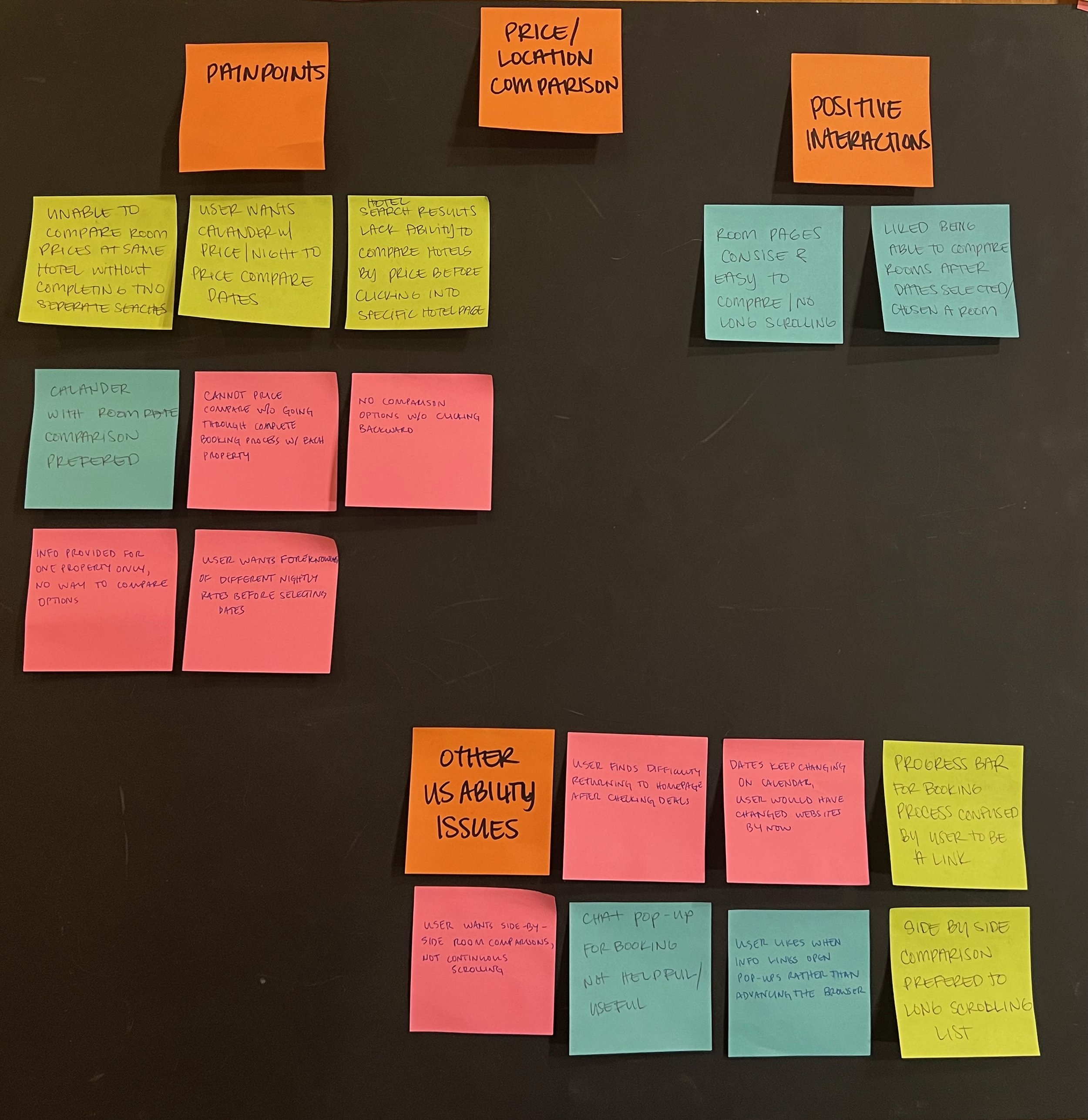
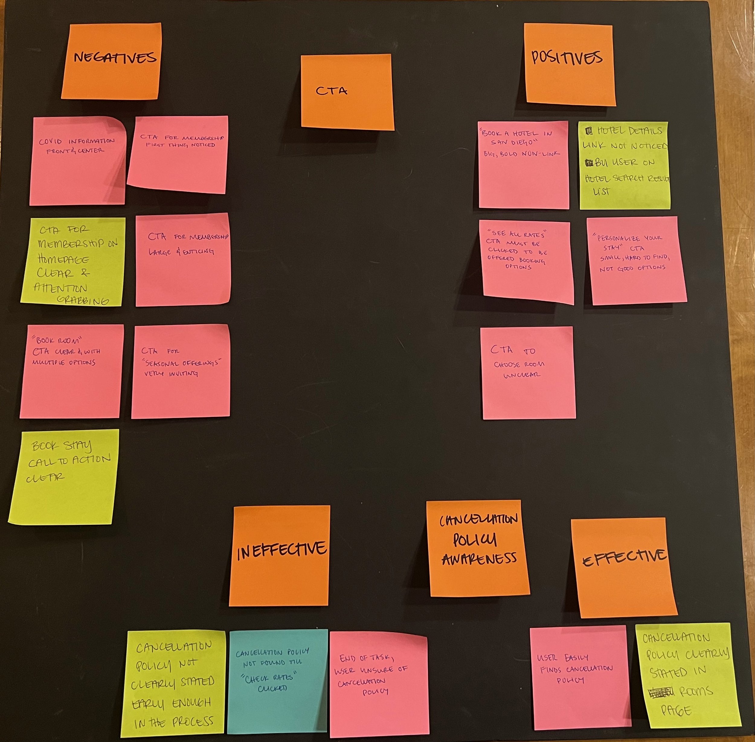
Affinity Diagram
This session was conducted with two designers and researchers.
Flow Chart
Creating the site’s user flow presented a number of interesting problems. I wanted the site to recognize returning customers as soon as possible. Once they were logged in, I wanted the site to remember everything besides the payment method to reduce the empty fields users would be required to fill out. After testing the first iteration of my prototype with two users, I had to change my approach. Neither user tested wanted to put in personal information early, if at all. My risk/reward assessment was incorrectly weighted toward ease of use rather than easing the users’ mental model; most people expect many fields when booking a hotel.
Sketches
Thankfully, there are many design conventions users expect throughout the booking process. These conventions made the designing easier as I wasn’t trying to reinvent anything, merely smoothing out the process. This iteration is full of image and copy space for the brand to advertise their premier services and properties, a choice of design I thought would be beneficial to the company.
Medium-fidelity prototype
This initial design was created using Figma. As I was learning the software while designing, there are few changes from my hand sketches and the flow chart. My established flow felt clear and easy to understand, and I wasn’t trying to make anything elaborate with this prototype.
Annotated prototype
After testing my medium-fidelity prototype on two users, they both wanted a higher level of design. As the interface became more heavily designed, it became clear that most screens were far too busy. In my attempts to highlight the business’s assets, I had broken the flow with which I had initially set out. Two complete redesigns later, this is the final design with hand-over annotations.


