Airline Booking - Research
While researching flight booking applications, two problems stood out to me. The main cause of user friction was the scanability of flight details during the search results. In many instances, users chose flights without realizing they had multiple connections, or excessively long layovers. The other main issue was that the progression between flight selection and the purchase screen had minimal standards across different airlines. Seat selection, passenger information, and itinerary pages came at different points in the process, leading to user friction when the progression wasn’t clear.
Competitive Benchmark
When researching the layout of flight results pages, I did multiple AB tests with users to determine which pieces of flight information were important enough to justify their inclusion into an information-packed screen. Flight number and airplane model, though often included, were never on the list of important information to users. Rather, it was clarity of the number of connections and a clear statement of layover lengths that were highly requested. Though all competitors listed the total travel time, few showed the duration of layovers versus actual flight time without a second interaction.
Usability Testing
In the overall progression of booking, the users tested didn't have a clear consensus for how the progress should flow. Passenger information, seat selection, and a confirmation page could be inserted nearly anywhere between flight selection and the payment page. Therefore it became clear that however I design my app, it’s important to clue the user in on why the progress moves as it does, rather than expect them to accept my ways.
Customer Journey Map

Airline Booking - Design
When it came time to design the flow for this app, I tried to follow a natural progression for the required information. Since users had different responses to competitors’ flow, it was important that what I designed not stray too greatly from standard models. Since airline regulations require people seated in exit rows to be above a certain age, the app needed to know the age of passengers before showing the seat selection process. The app must not allow the user to select a seat for a passenger who doesn’t fulfill this requirement! Also, since flights can easily sell out, it was important to me that the user not be encumbered with passenger information or upsells until after the flight selection was confirmed. After that point, it is easier for the system to inform the user they will lose their ticket selections if they back out or re-search flights without that choice causing friction.
Flowchart
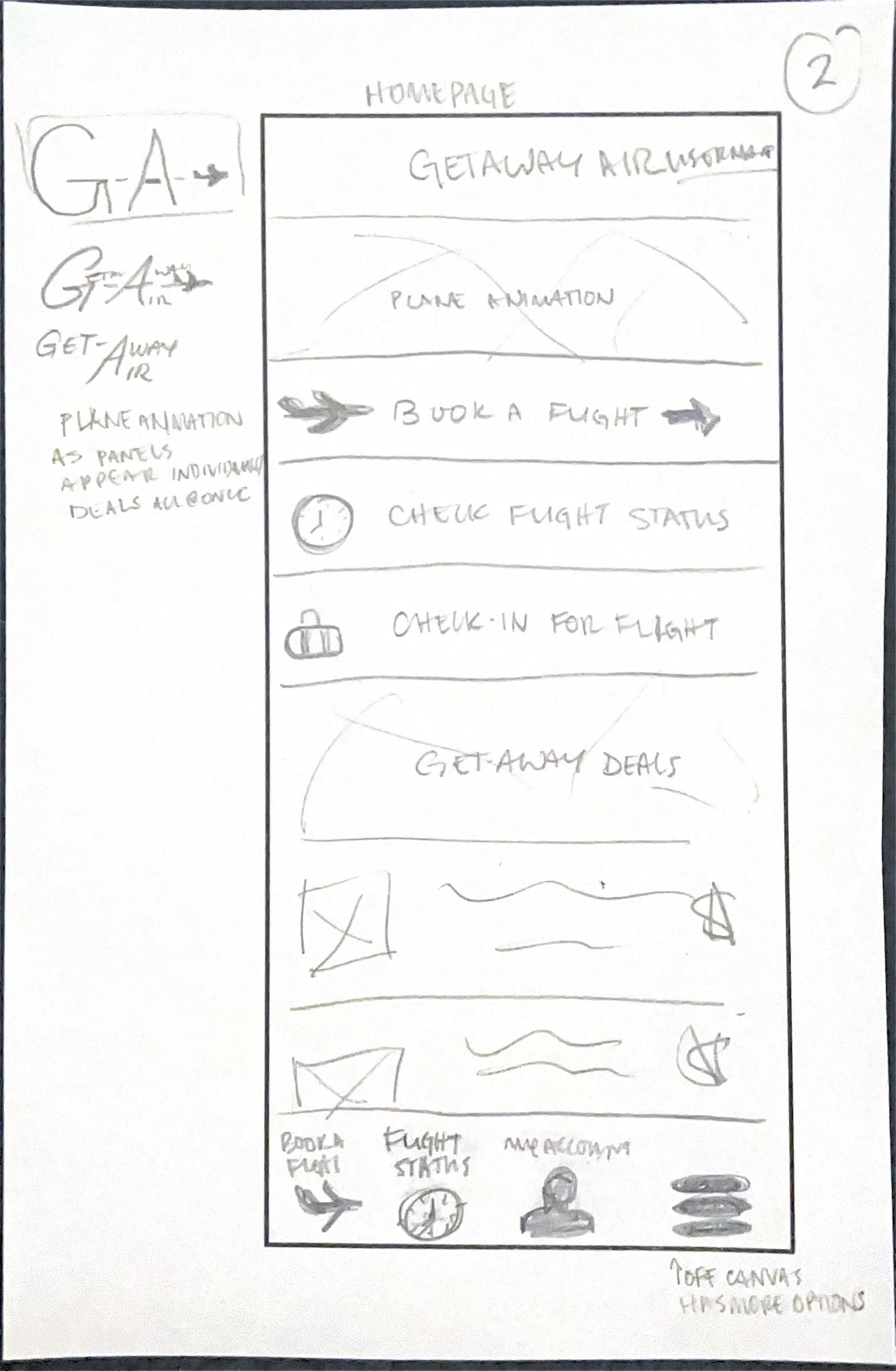
As often happens with my sketch phase of design, my individual pages have more interactivity than is necessary. Fun icons, sections for discounts and deals, and member’s only areas don’t often make it past this stage, but I always start with them. As I begin to add in the UI, the overall design becomes more clear and visually concise. I love giving the business and advertising arms of the company space to utilize on the main page, but it can’t be at the expense of the user’s experience. One user tested went on a rant about deals buttons on the home page, because, “They never are what you actually want!”
Sketches
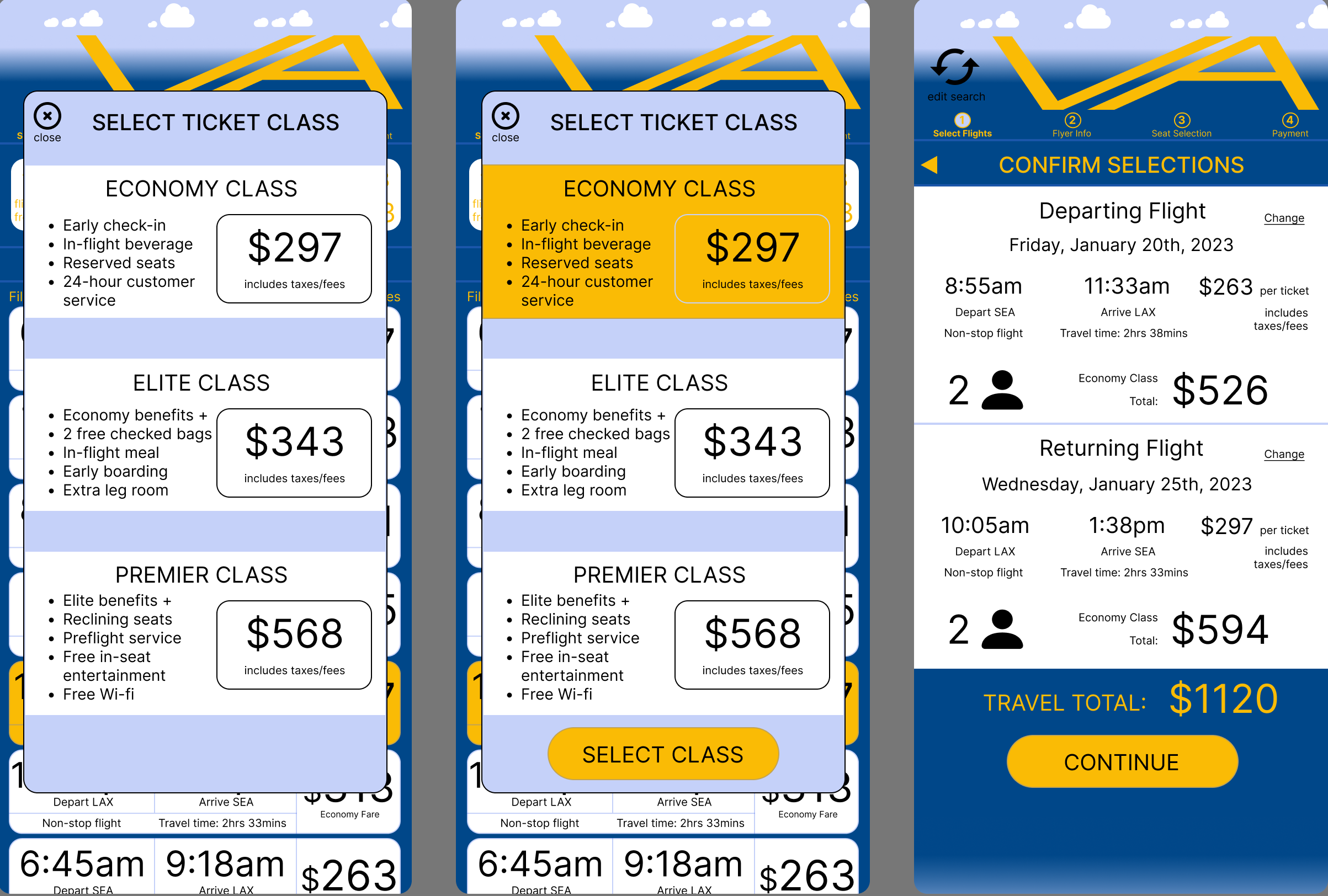
In the processes of digitizing my sketches into a prototype, I wanted the app to have a blend of professionalism with a dash of frivolity. Most users are, after all, planning a vacation. Small planes zooming through the air during loading screens and the clouds moving across the header hopefully add to the user experience as they plan their next vacation. And for business travelers, it should feel professional yet comfortable, so they want to return to the app for future travels. An app that mirrors the airlines terminal lounges: bright, warm, and inviting.
Medium-fidelity Prototype
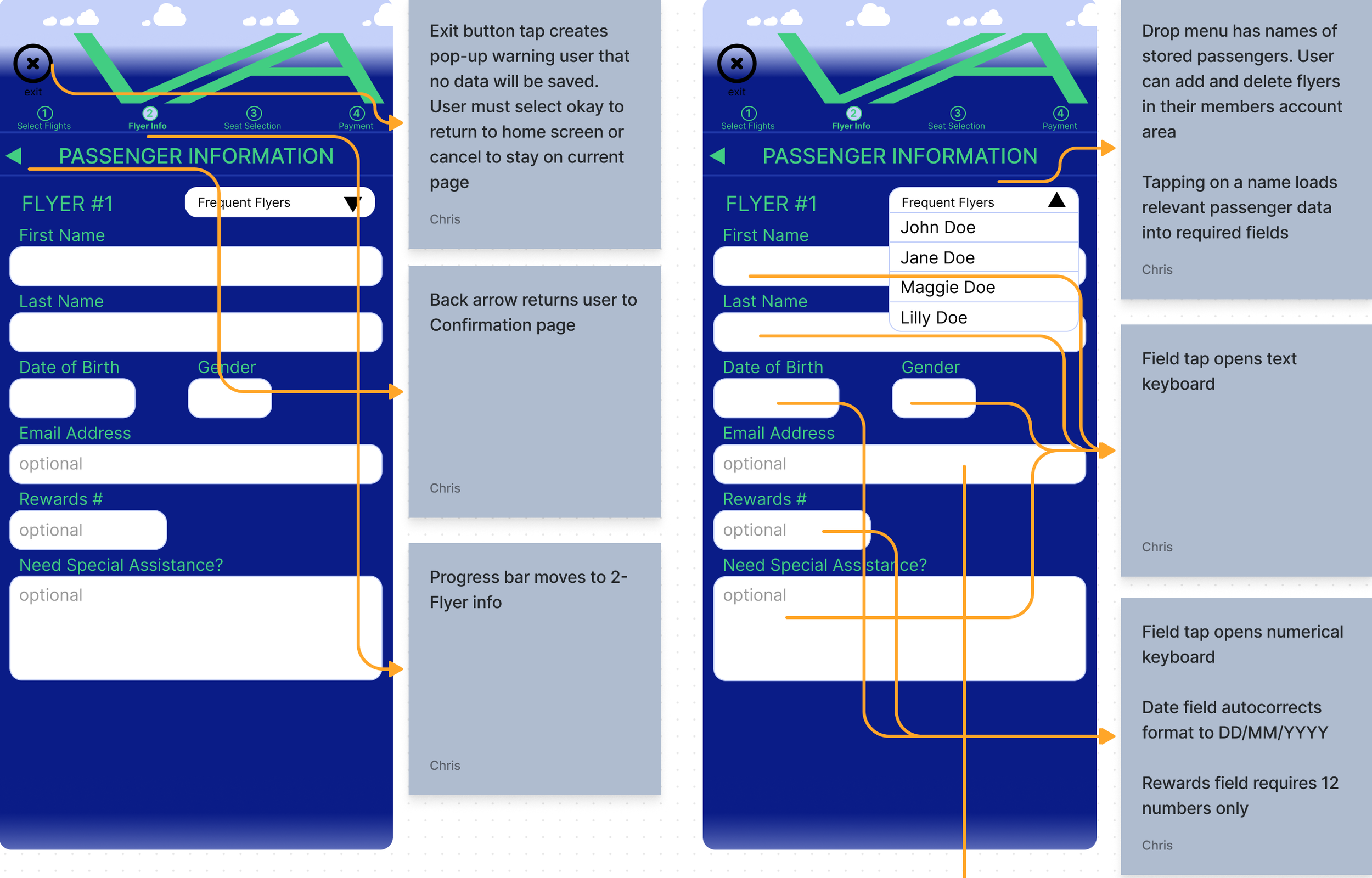
The passover documentation for this app is somewhat complex. To aid usability, the app allows the customer to view flights on the days surrounding their inputed date, as well as storing passenger information if the user requests it. In addition, booking plane tickets requires many information fields the user must fill out, each of which will have a specific keyboard appear on the device to aid the information input. Offering mobile pay eases the process somewhat, as does loading the known-passengers information when requested. In this design , the main user can store the required information for multiple passengers within the member area. Then when they are booking, the saved names appear in a drop menu that will load the relevant data and highlight the CTA.
Annotations


